Monday, 25 November 2013

Lost Sands Character Designing


 So as part of my second year we have to be assitant artists to the third year films. I've been put on a stop motion adventure, "Lost Sands". A film in the same vien as an Indiana Jones adventure where the hero Arthur James seeks a treasure that his long lost father went looking for. Our director Aaron had already pretty much got the design of Arthur down, but his father still needed some designing.

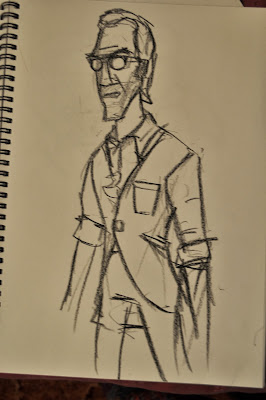
Initially the father was going to use the exact same armiture as arthur, so i kept the design similar in face and body shape, adding different hair and clothes to show a difference in time and age of the characters. Here are my first few concepts.


These designs were appreciated by the team, feleing we were going int he right kind of direction, Aaron like where I had taken the hair on his head, and face. Though maybe not such a big beard because it made him seem to old.


Following a design Aaron posted on facebook I knocked out that one above ont he left. Hear he looks nearer the age Aaron was looking for. The one jsut right of it wasw to test out some clothes ideas. Later on it was decided to make Arthurs character a bit younger and scrawnier and his father would be tougher and more angular, like he was the real Indiana jones, who had gone missing. Keeping with similar themes and styles I worked to make a tougher slightly younger version of the Father. He was to be out of adventure mode, Bruce Wayne, not batman.


So I worked though a few ideas going back and forth to Aaron and Thomas ( another 3rd year team member) we managed to settle on a look that was just old enough before appearing to old, just tought enough and just intellectual enough. So I drew up a more final design and then put it inot photoshop to add some colour. Here he is. The clothes are still a bit in flux as we finalise designs, but its all stareting to come together. Can't wait to start seeing the film come to life.


Thursday, 21 November 2013

Baseball Movie

So at uni this term, along with all the other shit, we're doing a small 20 second filom in groups of five. We each do 4 seconds of animation. I'm doing two shots of two seconds each. Oh and its about a baseball game, I got the exciting tsk of animating a crowd member. Just completeed the first shot so thought I'd upload it. ITs just animation without cleanup.


All I got right now. Probs shoudl ahve more up in a day or two, incase you're all paniced or something. Probably not though...

Peace

Thursday, 7 November 2013

Character Design Workshop


Last couple of weeks we had this character designer, Gillian Reed come into uni and show us her process for designing chracters.  First we just had to think of a character and a hobby. All i could think of was an alcoholic cat.  Having suffered the loss of his 93 year old owner Murial, he  resorted to a life on the street, getting drunk on super skol and white lighting, living off borrowed fags, and developing a dibilitating addiction to "the Nip", This is Skag Kat.

We were told to keep it loose, and keep it simple to start with. Just shapes, try and find a body shape that we felt embodied the character well. The one I liked I added a little more detail. You can probably pick him out below.


Next in the process, still keeping it simple, without detail, we had to sketch out some poses and actions that best describe the character. Using props if needed. I felt fags, cans and tesco bags being appropriate for a cat on the street.


Some more poses I did which I then put into photshop to experiment with colour. Starting to add more detail tho still working out some things.


Then we moved onto facial expressions. Emoting is pretty key so you wanna make sure you got  character who can actually express what he is feeling, especially in the the action heavy world of animation. Also it helps finalise facial features and head shape. Here I struggled....

...but it all came together in the end for the final part, the turnaround. Helps us see the character in three dimensions. Also if he was to ever be animated, makes it alot easier for the animator.
So here he is- Skag Kat, hes just trying to get by...

Tuesday, 5 November 2013

Artist study and stuff


 This week I have been working on my artist study for my degree. We ahve to take an artist or two ( or three) and try and mimic certain approaches and techniques they use, in an effort to improve our artistic vocabulary. I've started with comic book artist Frank Miller, notably Sin City, though I have looked at Dark Knight Returns and 300.  Here are some studies of his work. 
 Then I tried my hand at a rough study in ink of a page from "that Yellow Bastard"


 AFter I applied the same scrally sketch style in my life drawing session. Using big blocks of black ink to create that Sin City dramatic lighting effect. The model couldnt hold poses as dramatic and comic book-y as I would have liked, so in some cases I exagerated the pose and her form. Tried to make her look more Miller-esk.


 The last one I did was a 30 minute long pose. Felt it came out pretty well. Obviously my brush work isnt perfect yet so it doesnt look as perfect as the books do. So I put it into photshop and cleaned it up a bit.


And Finally I thought I'd also share a couple more tribesman concepts, and a little tune I made a while back. Enjoy!